Bislang haben wir Daten aus Datenbanken oder Datensätzen in Diagrammen dargestellt und ausgewertet. Letztlich sehen wir bei einer solchen Daten-Darstellung immer den letzten Zustand eines bestimmten Prozesses – oder, noch präziser formuliert: ein Prozess wird zu einem bestimmten Zeitpunkt eingefroren, und die Daten beschreiben diesen eingefrorenen Zustand. Ganz direkt trifft das bei einem Magmatit zu, der ja tatsächlich nichts anderes als gefrorenes Magma ist. Unser Ziel ist es, anhand der Daten des eingefrorenen Prozesses den Prozess des Magmas davor zu rekonstruieren. Das machen wir anhand von Modellen wie z.B. fraktionierte Kristallisation, aber auch Datierung, mit Hilfe einer eingefrorenen Isotopenzusammensetzung. Ein Prozess wird mit einer Gleichung beschrieben, welche über eine Funktion in einem Diagramm dargestellt wird. Dazu schauen wir uns an, wie man eine Funktion in Jupyter Notebooks darstellt.
Video nb
import numpy as npimport matplotlib.pyplot as pltfrom ipywidgets import interactimport warningswarnings.filterwarnings('ignore')#warnings.filterwarnings(action = 'once')
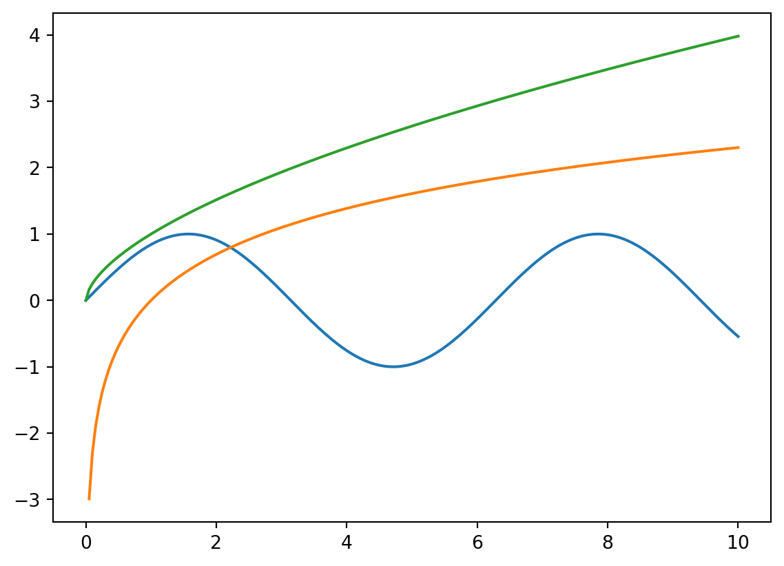
def complexModel(a, b, c): x = np.linspace(0, 10, 200) h = a *9/5- b y = h * np.sin(.3* np.power(x, 1.2) - c * np.log(x)) plt.plot(x, y)return plt.show()
interact(complexModel, a = (0, 5), b = (2, 7, .2), c = (1, 5, .1))
<function __main__.complexModel(a, b, c)>
Describe the principle how functions are plotted.
First, x-axis values are defined, e.g., using the numpy .linspace() method. Second, the y-axis values are calculated using the function, applied to the just defined the x-axis vlaues.
The ‘warnings’ package allows to suppres calculations such as dividing by 0.
✗True
✓False
A function is plotted on the interval defined by plt.xlim(xmin, xmax)
✗True
✓False
Practise
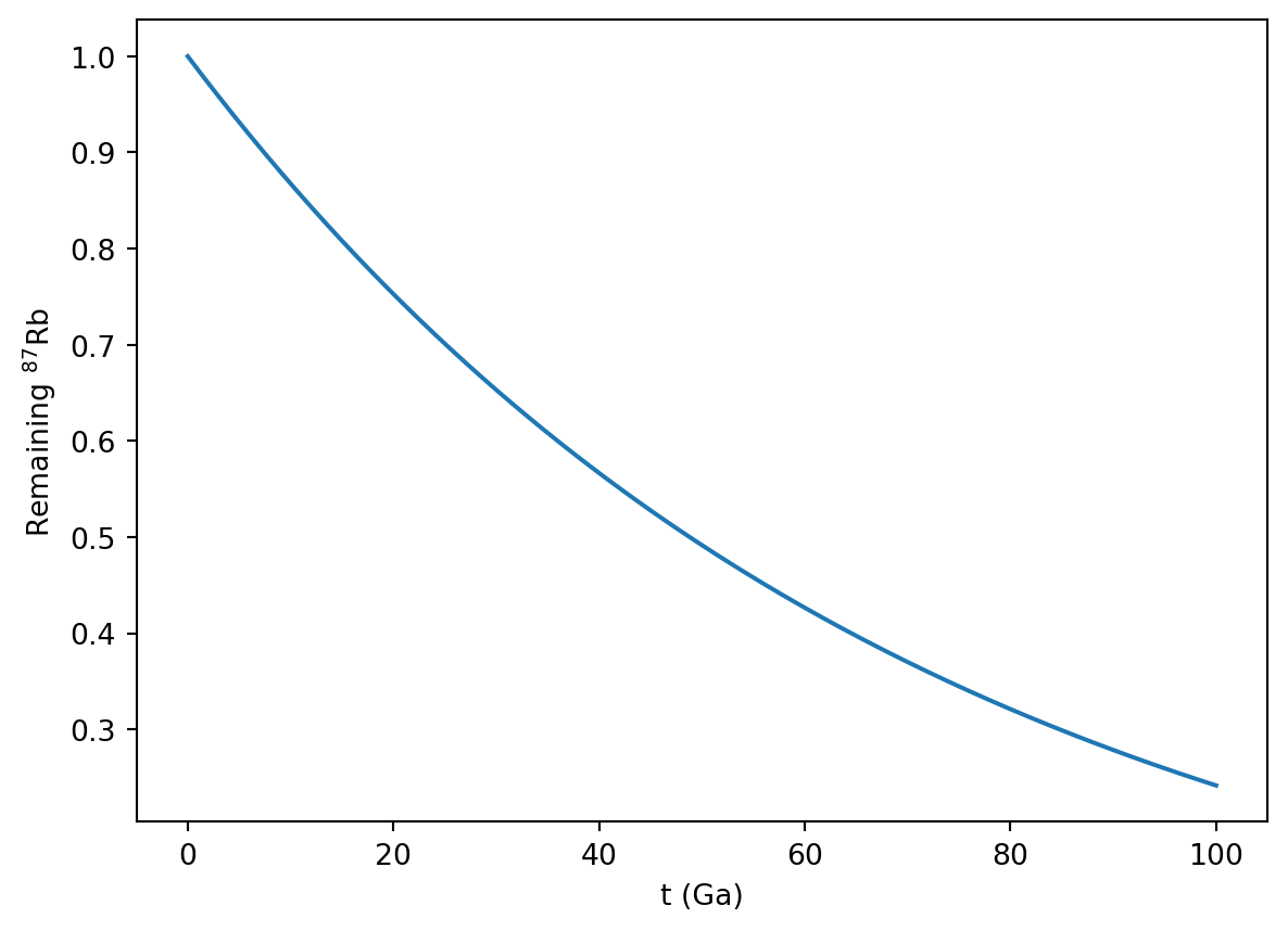
Search for the equation for the radioactive decay and plot this function.
Add x- and y-labels to the plot.
Solution
import numpy as npimport matplotlib.pyplot as plt
Rb87HalfLife =48.8#in GaRb87lambda = np.log(2)/Rb87HalfLife #log in numpy is Ln!! #Euler's number in numpy is 'exp' – as can be seen with this example:print(np.exp(1))t = np.linspace(0, 100, 200)y = np.exp(-Rb87lambda * t)plt.plot(t, y)plt.xlabel('t (Ga)')plt.ylabel('Remaining $^{87}$Rb')plt.show()
2.718281828459045
What’s wrong with this code?
The goal is to plot the batch melting function, with the melt degree F along the x-axis. The equation for batch melting is:
\[ c_l = \frac{c_0}{F + D * (1 - F)}\]
import numpy as npimport matplotlib.pyplot as pltc0 =23.86D =3.2x = linspace(0, 1, 75)y = c0 / (F + D * (1- F))plt.plot(x, y)show(plt)
.axhline() Available Notebooks: Lecture, Exercise, Solution
Rayleigh fractionation describes the isotope composition of the various phases during evaporation and condensation, with the following parameters:
f (0…1): Fraction of the gas (condensation) or liquid (evaporation) \(\alpha\): Fraction factor
Rl,0: Initial bulk liquid composition
Rv,0: Initial bulk gas composition
Rv: Composition in the remining gas
Rl: Composition of the current liquid
Rv,0: Initial bulk gas composition Rl: Composition of the entire, condensed liquid
Evaporation Equations
Isotope ratio of the remaining liquid: \[ R_l = R_{l_0} f^{\frac{1}{\alpha} -1}\]
Isotope ratio of the currently evaporating gas: \[ R_v = R_{l_0} \frac{1}{\alpha} f^{\frac{1}{\alpha} -1}\]
Isotope ratio of the evaporated gas so far: \[ \overline{R_v} = R_{l_0} \frac{1 - f^{\frac{1} {\alpha}}} {1 - f} \]
Condensation Equations
Isotope ratio of the remaining gas phase: \[ R_v = R_{v_0} f^{\alpha -1}\]
Isotope ratio of the currently evaporating liquid: \[ R_l = R_{v_0} \alpha f^{\alpha -1}\]
Isotope ratio of the evaporated liquid so far: \[ \overline{R_l} = R_{v_0} \frac{1 - f^\alpha} {1 - f} \]
Video nb
import numpy as npimport matplotlib.pyplot as pltfrom ipywidgets import interactimport warningswarnings.filterwarnings('ignore')#warnings.filterwarnings(action='once')
How can multiple functions be plotted in a single plt.plot(…) command?
The value 3.141 is assigened to the variable pi, the value 31.432 is assigened to the variable val, and the string ‘imaginative’ is assigened to the variable param.
A function (e.g., R0 * np.power(f, alpha - 1)) can be directly placed into the plt.plot(…) command.
✓True
✗False
Variables from interactive controls can be used for multiple plots.
✓True
✗False
Practise
Show an interactive decay plot with the half-life as variable. In a plot next to this, shwo the increase of the daughter isotope.
The x-axis shall go from 0 to the age of the Earth.
Suppress the appearing warnings.
Solution
import numpy as npimport matplotlib.pyplot as pltfrom ipywidgets import interactimport warningswarnings.filterwarnings('ignore')
scipy, .stats, linregress(), Available Notebooks: Lecture, Exercise, Solution
Wir haben die Daten-Darstellung kennen gelernt, die Modellierung, auch Einblicke in die Daten- Analyse erhalten – und natürlich gibt es ausgiebig Packages zu etwas statistischen Analysen. Beispielhaft möchte ich die lineare Regression zeigen, die wir sehr häufig in der analytischen Mineralogie verwenden. Von dort ausgehend lassen sich leicht Packages und Methoden für die eigenen Problemstellungen finden. Und letztlich sind Methoden wie die lineare Regression nichts anderes als Funktionen, welche nicht mehr programmiert werden müssen, sondern schon vorgefertigt in Packages heraus verwendet werden können.
Video nb
import mag4 as mgimport pandas as pdimport numpy as npimport matplotlib.pyplot as pltfrom scipy import stats
What is the result of: pi, val, param = [3.141, 31.432, ‘imaginative’]
The value 3.141 is assigened to the variable pi, the value 31.432 is assigened to the variable val, and the string ‘imaginative’ is assigened to the variable param.
stats is a Python Package
✗True
✓False
What is the argument called to define the layer on which data are drawn?
✗order
✗xorder
✗yorder
✓zorder
Practise
A challenge
Make an interactive plot in wich you can select a csv-file out of all csv-files from a folder using a drop-dwon menu.
Make drop-downs for the REE that you extract from one file.
Also plot a regression through the data.
Solution
import mag4 as mgimport pandas as pdimport numpy as npimport matplotlib.pyplot as pltfrom ipywidgets import interact, widgetsfrom scipy import stats
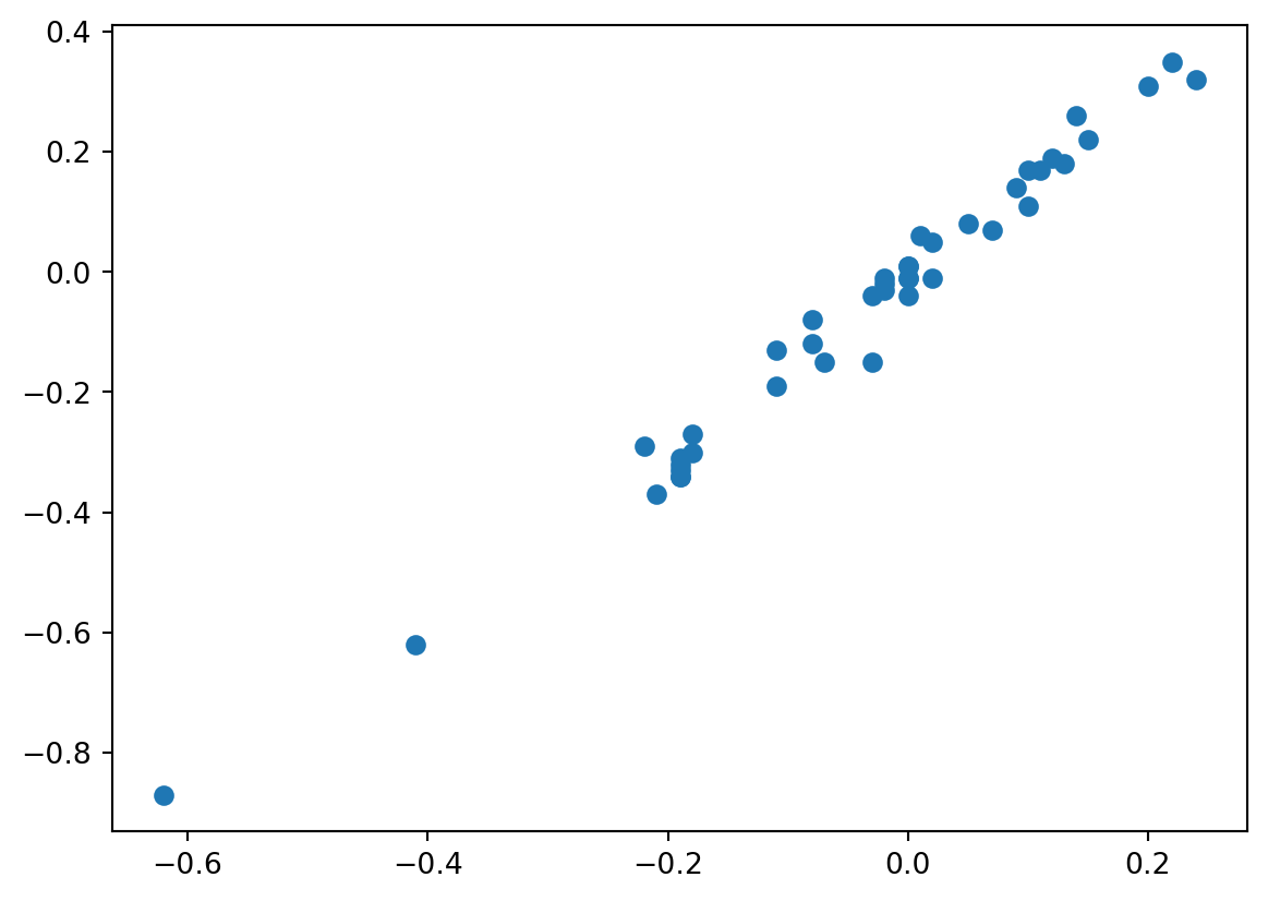
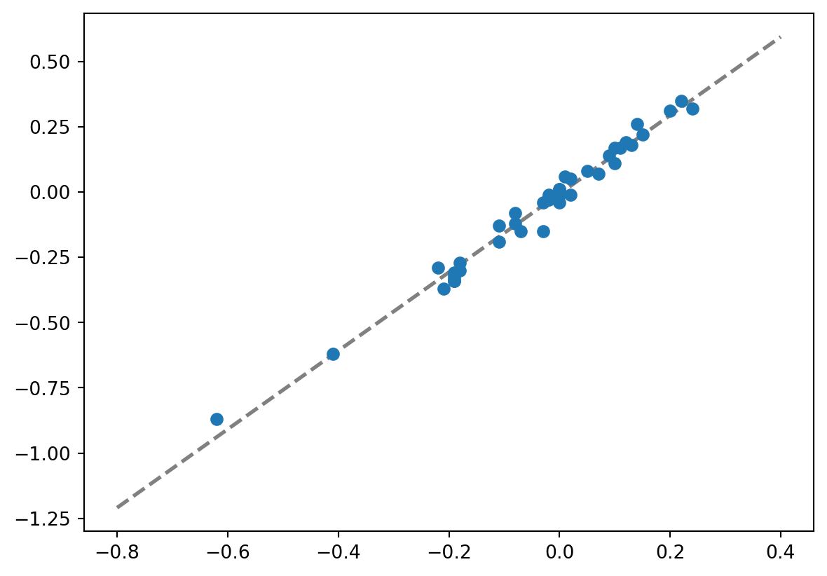
# Selecting all Georoc files from mag4df_mag4 = mg.available_datasets()fil = df_mag4['Source'] =='Georoc'df_mag4_georoc = df_mag4[fil][['Source', 'Short Title', 'Title']]df_mag4_georoc
We usually use interact(sc_plot, xEl=('Si', elements), yEl=elements). I modified this slightly using widgets (a package I import above together with interact), so an initial value for the dropdown menues can be preselected. There is no error in this modified, new part.
def dataWithRegression(file, el1, el2): df = mg.get_data(file)#dropna is critical, as regression does not work, should there be cells with no data data = df.loc[:, [el1, el2]].dropna() xAxis = data[el1] yAxis = data[el2]#Using these min and max methods makes the code even more flexible xAxisValues = np.linspace(min(xAxis), max(xAxis)) slope, intercept, rvalue, pvalue, stderr = stats.linregress(xAxis, yAxis) plt.scatter(xAxis, yAxis, marker =6, s =70, color ='teal', zorder =2) plt.plot(xAxisValues, slope * xAxisValues + intercept, '--', color ='grey', zorder =1) plt.xlabel(el1) plt.ylabel(el2)return plt.show()interact(dataWithRegression, file= filesList, el1=widgets.Dropdown(options=elList, value='La'), el2=widgets.Dropdown(options=elList, value='Ce'))
import pandas as pdimport matplotlib.pyplot as pltdf = mg.get_data('Hyblean or Iblean Plateau, Sicily')df.iloc[:, ('Mn', 'Al')].dropna
Solution
coming
a, b, c = [3, 1, 7]if a ==3:print(b)else c =4:print(b)else b > aprint('what a stupid code')
Solution
coming
for i inrange.4:def addTwo(i) i +2return i
Solution
coming
6.4 Command- Plot data points with error bars [06:34]
.errorbar() Available Notebooks: Lecture, Exercise, Solution
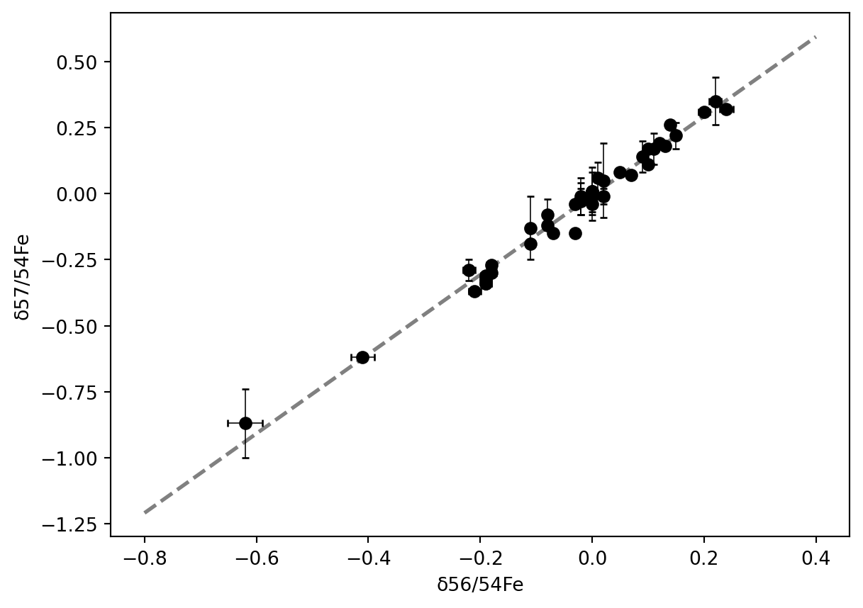
Einer der wichtigsten Parameter der Analytik sind deren Fehler und Standardabweichung in allen Variation (intern, extern, long-term, etc.). Natürlich lassen sich Fehler einfach und mit hoher Granularität in Abbildungen darstellen. Auch Fehler-Umhüllende sind einfach darstellbar, auf die ich einmal nicht eingehen werde, sondern nur darauf, Fehlerbalken den Datenpunkten einfach hinzuzufügen.
Video nb
import mag4 as mgimport pandas as pdimport numpy as npimport matplotlib.pyplot as pltfrom scipy import stats
How do .scatter() and .errorbar() differe from each other?
The basic structure is actually very similar. In fact, replacing .scatter() by .errorbar() does not change anything. The difference is that .errobar() takes additional arguments such as xerr, yerr and styling arguments for the error bars.
Error bars can only be absolute or relative.
✓True
✗False
The method ‘errorbar’ requires the import of scipy.
✗True
✓False
Practise
Make an interactive plot in wich you can select a csv-file out of all csv-files from a folder using a drop-dwon menu.
Make drop-downs for the REE that you extract from one file.
Plot the data with errorbars. The error shall be selectable with a slider. The error shall be a relative error, between 0 and 20% of the data value.
Solution
import mag4 as mgimport pandas as pdimport matplotlib.pyplot as pltfrom ipywidgets import interact, widgets
# Selecting all Georoc files from mag4df_mag4 = mg.available_datasets()fil = df_mag4['Source'] =='Georoc'df_mag4_georoc = df_mag4[fil][['Source', 'Short Title', 'Title']]df_mag4_georoc
We usually use interact(sc_plot, xEl=('Si', elements), yEl=elements). I modified this slightly using widgets (a package I import above together with interact), so an initial value for the dropdown menues can be preselected. There is no error in this modified, new part.
file, el1, el2, and err need to be defined
must be plt.errorbar(), not plt.scatter should be err * df[el1], not err / df[el1]return before plt.show() must be removed, it is not a function definition